In this tutorial we had to follow a tutorial to make our name blend together. We will also be able to use this tutorial for our title on our movie posters that we are making. I used a custom font and what I did to make it my own was expand out the letters and then also changed the spacing between some of the letters. I also lined up the l and the h so it made it look like one long line and I thought it looked pretty cool too.
In this project we created a "Top Tens" list based on what things we value the most. So what I chose are either my favorite things or things that I value a lot. In my list, I included Family, Michigan, My favorite restaurant, My favorite Movie, baseball, KU, The Royals, Money, My phone, and NetFlix.
Choosing the right fonts and typefaces was also an important part to this project because you want to get your point across about why you chose a certain object, and the rights fonts and sizes can help you get that point across. It also helps organize you poster better when you have the right fonts and sizes. I chose the fonts "PT Sans (Italic Bold), Open Sans Regular, and Minion Pro because I wanted a sophisticated looking poster.
What I learned from this project was that our values can tell a lot of things about ourselves, and typefaces can too. This was also the first time that I used InDesign and the first time I created a grid layout and made a poster to be printed.
In this project, we had to create 3 different postcards. The fall postcard pretty much helped me figure out how to use the clipping mask, then I used that on my Zach postcard. The Holidays postcard was inspired by a Hawaii postcard that we made earlier.
One problem that I encountered while doing these projects was being able to put images behind letters. I was able to solve this problem by reading the instructions thoroughly and adding a clipping mask to the layers and images.
This was my attempt at doing two different journalism projects, one over the annual ONW Blood drive and the other over the annual ONW Lego day.
Our process was different than what we are used to, for the Blood Drive, we didn't really get that much instruction to what we were supposed to do when filming the people so we couldn't really get all of the shots that we wanted. But for the editing process, we had to find different "sound bytes", or different times when the person you interviewed spoke, then we had to write a script based on those sound bytes and then come up with our own voice over to tell the story that we wanted to. For the lego project, we had a little more time to prepare what we were going to do but it was pretty much the same process.
What Did I Learn?
The main thing I learned from this project was how to keep a camera steady and also how to interview people for different shots. I also learned how the microphones work so that I could gather quality audio. I also lean red that you need good teamwork with the other people in your group so that it all goes smoothly.
I would plan my shots differently, and also gather more shots if I was to do this project again because for some of the pieces, I felt like I didn't have enough shots to make a whole story. I would also come up with a better script because I realized that it was an important piece to the project.
I guess I would keep my audio the same if I was to do this project again because I felt like I gathered fairly good audio.
I learned that I need a lot more close ups to make the story interesting and I think that would enhance my video for next time.
How would these 2 projects compare?
If I was to compare the two projects, I think that my preparation for the Lego Project was better but the Blood Drive turned out better. I think I had a better voiceover, and better shots for the Blood drive.
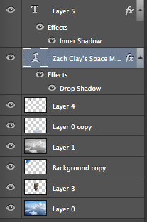
We started this "Floating Mountain" project by learning about "Pixel fringe" and how you can get rid of it so that you can make images look good. The first thing I had to do to complete this project was to find and extract a picture of a mountain. The next thing I had to do was set the mountain image to a new "sky background". Then I had to extract 2 more images and add them onto my Mountain image. I chose my the spaceship and the big moon because I wanted to go for a "futuristic"feel, which the spaceship showed. And the moon represented that the floating mountain was kind of out of this world.
In this project, I learned how to use the "Quick Selection Tool" to select the part of the image I want and add them into another background. I also found that it was kind of hard to put the mountain behind the first cloud, but I eventually learned to add that to the layer above the mountain so it all worked out.
If I could do this project again, I would try to blend the mountain and the images better. I would've also liked to make the moon look like it was behind all of the clouds, instead of it being sort of in front of the clouds. I would keep the images the same, because I like what they represented, like it was futuristic and from a different world.
I can enhance the next project I do with this because I now know more shortcut tools, Like "W" is the quick selection tool, which can help me extract more images. I also will know how to blend more images.
Overall, I liked this project and I thought that it taught me a lot about the "Photoshop" program, like how you can be very creative with what you post, and the possibilities can be endless.
The scope of this project was to create an original version of a music video. My group chose the song "Sail" by AWOLNATION for our video.
What was the process for this project?
We started this project out by coming up with an idea then finding a song that could match that idea. I didn't really like the idea that my group chose because it didn't really make that much sense but we had to go through with it. After we found our song and idea, then we had to create a storyboard with different shots that we could do to tell our story. Then we had to make a film schedule so we could get our projects done in time for the due date. Then we actually had to go out and film the shots based on how we made our storyboard.
Then for post production, we had to edit our films so the shots went by quick and we also used different effects in our edits to make the film more interesting.
What did I learn?
I learned throughout this project that having a good idea can make or brake your project. I think that if I was to do this project again, I would be more creative during the idea process and not be so critical.
I would do the same with my shot choice and edit because I liked how both of those things turned out.
I think that I can enhance my next project by being more creative and cooperative with my group.
In this project, we had to search up a sphere tutorial for Photoshop and Illustrator.
I started out this project by googling tutorials for both programs, then I decided which one would look the best. Then once I finished, I turned it in on my blogger site.
3 things that are different between the 2 programs are that Photoshop is a bit map, and Illustrator is a vector, Photoshop uses filters while illustrator uses effects, and photoshop saves as a .jpg or .png and Illustrator saves as a PDF.
Ine the Illustrator tutorial, I learned how to put symbols on objects that I create, and on the photoshop tutorial I learned how to add different layers onto an object so it looks like a sphere.
I need to learn more about all the other different tools, so that I can become more familiar with the programs.
The sites I used were http://ibrandstudio.com/tutorials/how-to-create-3d-ball-in-photoshop
and http://pixelrockit.com/create-stylish-3d-shapes-with-adobe-illustrator/