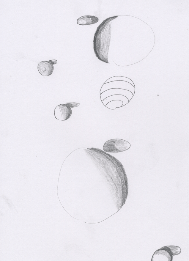
In this project, we had to create spheres by hand, and in different programs like Illustrator and Photoshop. I personally thought that making a sphere in photoshop was easier than making a sphere in Illustrator, I also thought that it looked better too. To me, spheres are also very hard to draw by hand. You have to shade spheres based on which way the light is coming onto them. The sphere is brightest where it directly faces the light, and then it gets darker the farther away the object is facing.
Thursday, October 23, 2014
Tuesday, October 7, 2014
Personal Logo
While making this, I learned how to do cool effects with letters, like extending my Z throughout the whole logo. I also learned how to make the text look 3-D, with shadow behind it.
I think that what I did well on this logo was coming up with an original idea, and I also think I chose the right color scheme.
If I were to do this project differently, I would probably try some more text effects to make it more creative.
I think that I need to work more on knowing all of the things that illustrator can do, so that I could make things look unique.
This was the process that I went through to make my design.
Friday, October 3, 2014
Logo Tutorial
This was a logo I made doing a tutorial. I chose to do this particular tutorial because I thought that the logo looked fun, but also kind of challenging. While doing the tutorial, I learned how to put a pattern on the text and I also learned how to make a cool looking 3-D text. On my actual logo, I will use a different color scheme and also do a different design. I think I did well making the lightning bolt and also making the text.
Subscribe to:
Comments (Atom)


